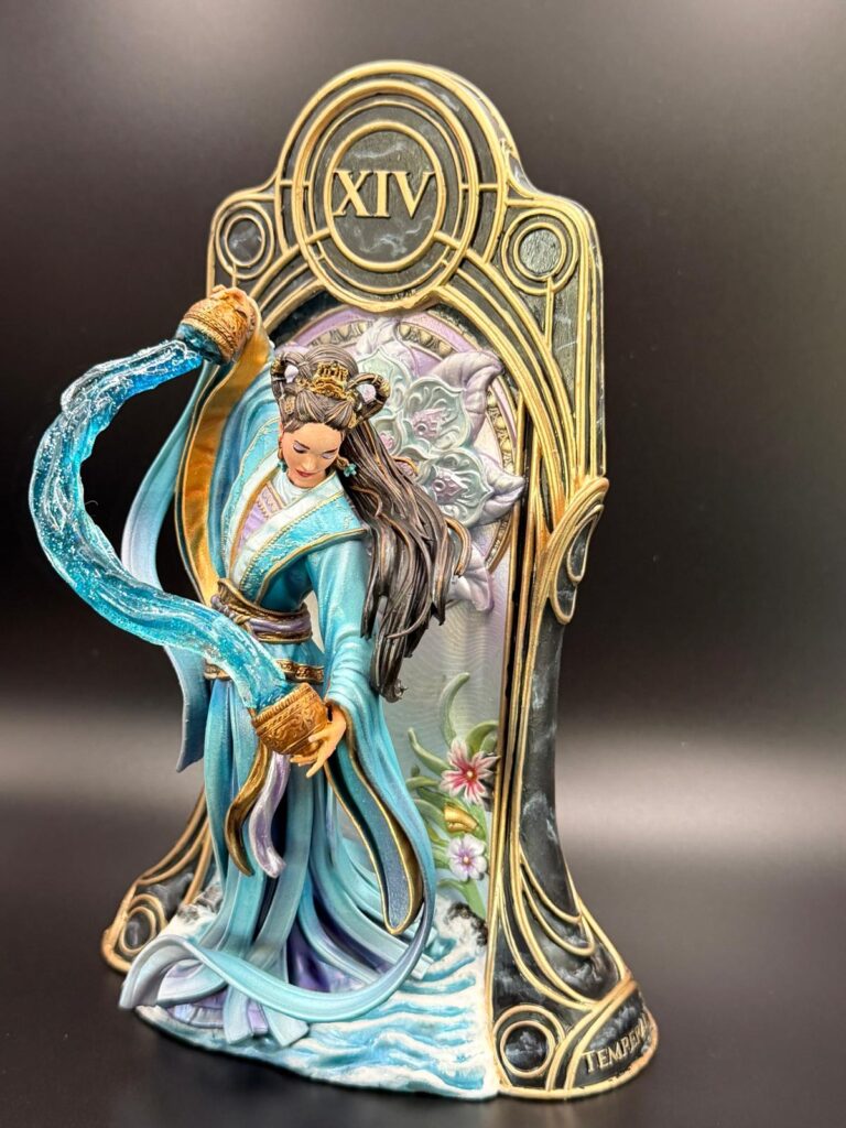
By mid-May, I could finally start.
My printer had produced a reasonably good version of Temperance, and I was more than ready to begin priming. After all the failed prints, waiting, adjusting, hoping, and occasionally staring at the printer as if pure disappointment could improve its performance, I was very happy to finally hold something usable in my hands.
So I started preparing the model.
And then, of course, I noticed something.
Layer lines.
Everywhere.
Not just a tiny little line here and there. No, the kind of layer lines that suddenly become impossible to ignore once you have seen them. The kind that whisper, “You could paint me… but you will know I am here forever.”
And because I am apparently incapable of simply accepting things and moving on, the only logical solution was:
Print it again.
New printer settings. More testing. More waiting. More hope. More quiet negotiations with the machine.
While the printer was busy trying to prove that it could, in fact, behave like a useful piece of technology, I decided not to waste the failed prints. If they were not good enough for the final version, they could at least serve a noble purpose.
Experiments.
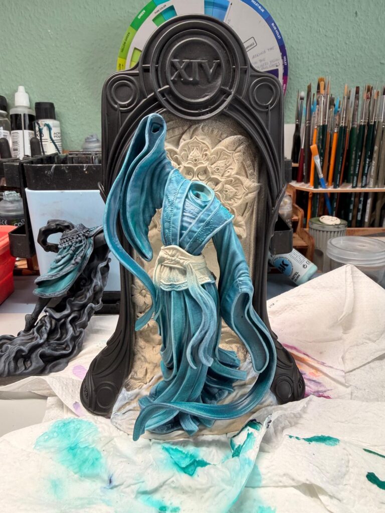
For the next two days, I used the misprints to test the first colours, try out ideas, and see what might actually work on the figure. And honestly, this was probably the best thing that could have happened. There is something wonderfully freeing about painting on a failed print. The pressure is gone. The fear of ruining the “real” model disappears.
You can just try things.
Too bright? Fine.
Too dark? Also fine.
A terrible idea? Excellent. Now I know.
So while the proper version of Temperance was still slowly becoming a reality inside the printer, I began my first colour experiments on the unlucky victims of previous print failures.
And that is where the real painting adventure finally started.
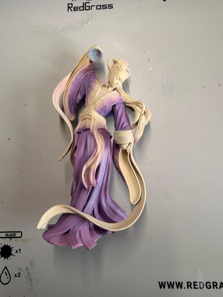
The real adventure
The turquoise test robe looked great.
Really great, actually.
It was one of those moments where you look at a test piece and think, “Yes. This could work.” The colour had exactly the kind of freshness and contrast I had hoped for, and on its own, I liked it a lot.
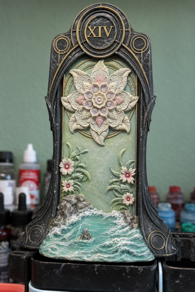
Unfortunately, it did not really work with the colours of the background.
But that was fine. It all were only a failed prints.
No pressure. No tragedy. Just a little sigh and another reminder that colours can be very charming liars when they are not placed next to their future neighbours yet.
And then a new thought appeared.
What if, instead of simply putting something cool against the heat of the lava, I created something more elegant? Something almost pearlescent. A cool, shimmering contrast to the fire. Less “water versus lava” and more “ethereal calm against burning chaos.”
And that was the moment I drifted away from my original concept completely.
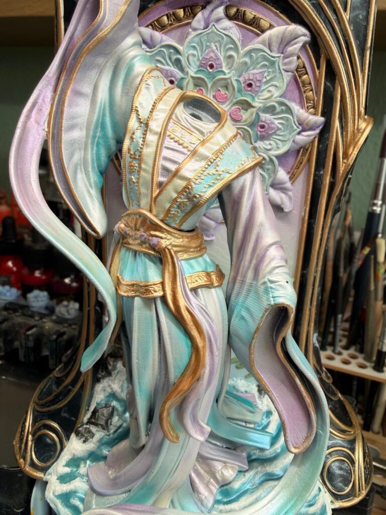
The new print of the card suddenly received a very different colour palette: lavender, ice blue, soft rose tones — everything much more atmospheric, delicate, and almost otherworldly.
Beautiful?
Yes.
Planned?
Not exactly.
Still connected to my original idea?
Let’s say… creatively related.
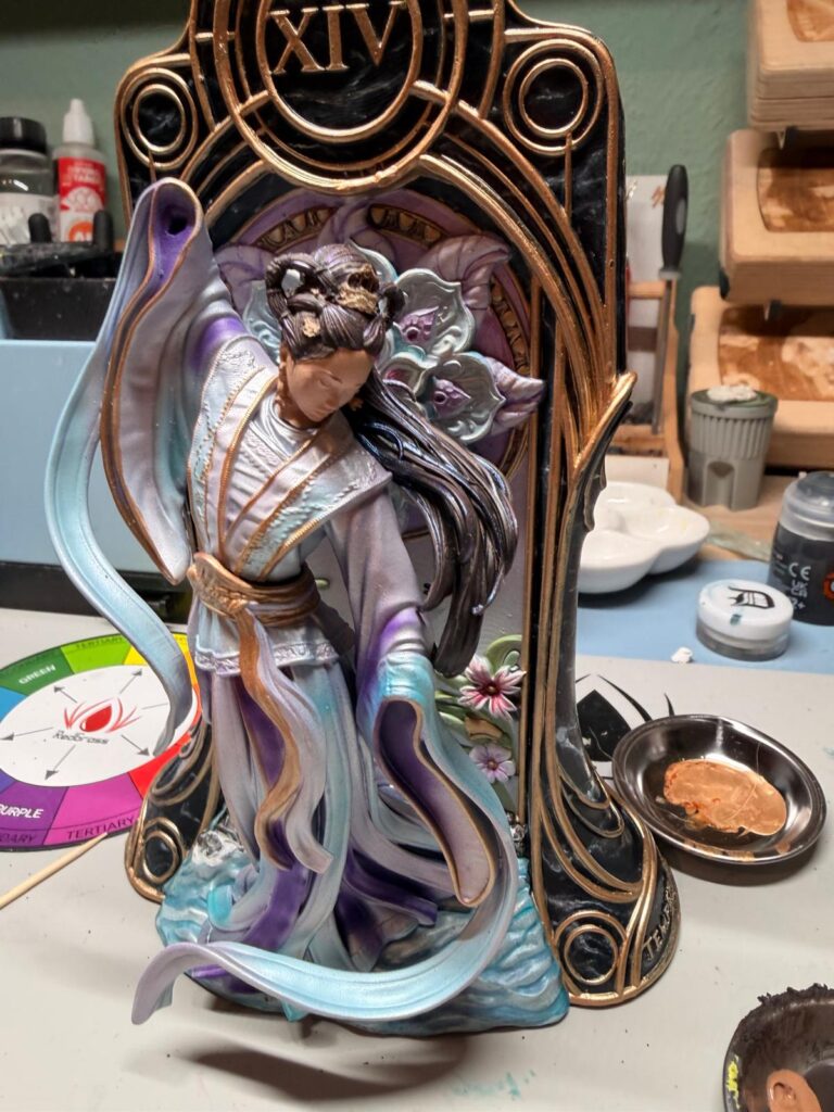
The problem was obvious very quickly: the turquoise figure no longer belonged there. She had looked lovely before, but now she was standing in the middle of this dreamy, pearly, icy background like she had accidentally walked into the wrong painting.
So, of course, I had to change the colours of the figure as well.
Because apparently choosing one colour palette was not enough.
No, no.
Why make one decision when you can open the door to an entirely new round of artistic uncertainty?
And I liked it.
I really did.
The figure suddenly had this cool elegance, a quiet calmness, and a soft sense of harmony. It felt almost serene. Almost spiritual. Exactly the kind of atmosphere I had wanted.
Well.
Almost.
Because if we politely ignore the fact that the visual connection between the two figures had more or less disappeared — along with the message I originally wanted to show — then yes, it was perfect.
At home, however, my critism was met mostly with head-shaking.
And, to be fair, I understood why.
At this point, I had barely two days left before my holiday, which also meant barely two days before my personal deadline. I would be away from mid-June until the beginning of July, so if the figure was not finished before then, it would simply not be finished in time.
Naturally, this was the ideal moment to make a completely rational decision.
Print the water figure again.
Because why not?
In the meantime, the earring of the fire figure had broken off anyway, and I already had to reprint the head. So I thought I might as well fill the rest of the build plate with a new version of the water figure.
Completely reasonable.
The printer ran overnight. The next morning, the new parts were washed, cured, and left to dry for a short moment that probably only counted as “drying” because I really wanted it to.
Then everything was primed again.
Then it had to dry again.
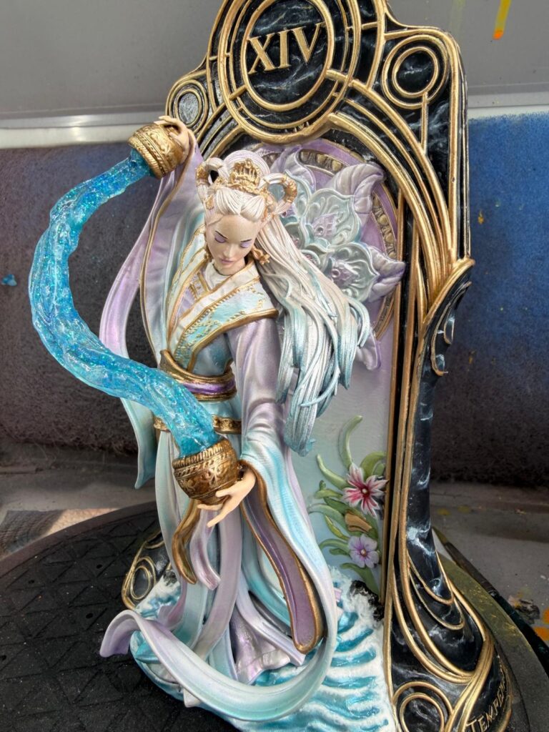
And then, in a beautifully calm and well-planned half-night painting session — meaning: tired, slightly desperate, and with very little room for mistakes — I repainted the robe in turquoise.
Back to the colour that had started all this madness.
Back to the connection between both sides.
Back to my idea behind Temperance.
The finish line
The day before leaving for holiday.
Also known as the day when normal people clean the house, do the last laundry, pack the suitcases, check documents, prepare snacks, and make sure everyone has enough socks.
Or, alternatively, the day when you decide to finish a miniature.
While repeatedly telling yourself that it really does not matter whether you finish it or not.
A very convincing lie.
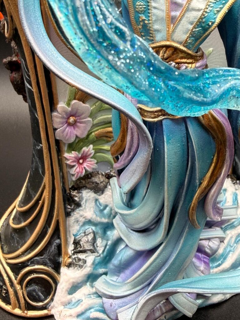
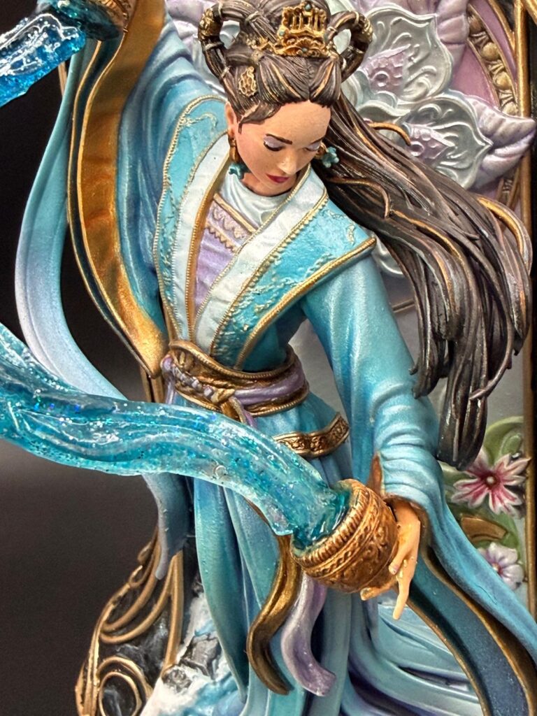
By then, the water background was finally done. The robe received a shimmering pearlescent effect at the bottom, to bring back the connection to the water and give it a softer, flowing transition. I managed to finish the face, and I added fine golden strands to the hair — tiny little details that made me very happy and also very aware that time was running away from me.
And then there was the resin water.
Oh, the resin water.
After about ten attempts, it finally worked.
I did not have the right alcohol ink, because — fun little detail — I had never worked with resin before. And even in Cologne, getting exactly the right ink at exactly the last possible moment turned out to be less simple than one might hope.
So the blue I had simply had to be enough.
At some point, you stop searching for perfection and start negotiating with reality.
A very big thank you goes to my darling, who separated the vessels and hands from the resin water for me that day and bought me a little extra time. Honestly, that probably saved more than just the miniature. It may also have saved my remaining nerves.
Finally, the water stream was glued between the vessels.
And then…
Done.
Well, done enough.
And sometimes, especially the day before a holiday, “done enough” is the most beautiful phrase in the world.